 This is my clay animal. I happen to have chosen a pig. The pig is a lazy, delicious creature. I had a very odd inspiration for this. For some odd reason, I was thinking of the term that women like to use, “men are pigs”. When thinking this, I thought “Sexist insult, or inspiration?” Thus, my project was conceived. Out of all the projects I do in art classes, clay is always the most annoying and tedious. It’s messy, and hard to control. Don’t even get me started on wheels. Overall, I’m glad to be done with clay.
Semester 2 Beginning
In semester 1 of 3D Art, I learned about wood crafts and critiquing art. I feel that I didn’t try hard enough with my work, so I intend to try and put forth more effort when working on assignments. When working with wood, we made lots of forms from multiple wood panels. I believe this could apply when working with slab-style clay forms.
Ad

Wood Product Reflection


In our 3D Art Class, we made different shapes from a soft wood. We started by making simple shapes in the form of a diamond, pyramid, cube, and rectangle. We then made a frame for future projects. After this came time for our main project. We were told to make a sculpture of certain media, using what we’ve learned. I decided to base my project off of the 1976 album by Pink Floyd, “Dark Side of the Moon”. This uses a triangular prism. I made the prism, added pieces to it, and sprayed the wood with polyeurythane, to reinforce it.
Consumerism in Art: Barbara Kruger


In this blog post, I am critiquing the works of Barbara Kruger, a modern artist and political activist. The two works I am critiquing are called “Money Can Buy Me Love” and “I Shop, Therefore I Am”.
Description: What do you see?
In these posters are pictures that Kruger presumably used from a magazine, with captions over them. These captions are usually bold, with a contrasting backround, and the images have a red border. However, what I see is plagiarism. Apparently, many of her works come from images (that aren’t hers) she finds in magazines and catalogs, which is supposed to play into her protests of consumerism. This wouldn’t be such a problem if she did more with the picture than put a caption on it, or inverted the colors. Even Warhol changed the pictures he used.
Analyze: How did the artist do it?
Oh, boy. This is a good one. Well, as I said earlier, the artist takes photos (that aren’t hers to take) from magazines and catalogs, apparently to convey her protests of consumerism, and puts captions over them, with her quotes in a Futura Bold font. And using Warhol again, while Kruger doesn’t egotistically go as far as him insisting that his art is a “masterpiece”, she does insist that making these works is a big challenge, and brags that she “figured out” how to make these. While I do agree that it must have been a challenge dodging lawsuits from companies that she took images from, I don’t think it was nearly as difficult as she says.
Interpretation: What is the artist trying to say?
Kruger insists that her works are rich in meaning. She claims the images she uses (that aren’t hers to use) are stepping stones for her message, and she sometimes alters the images to suggest a mood or theme. The messages are simple, and that’s okay, but they’re delivered in a simple way. This has gotten even worse over time, with posters such as a picture of President Donald Trump with a caption that says “LOSER”, or a poster of someone saying “Gender is Irrelevent”. It’s not intelligently made, not clever, and certainly not artistic. The artwork isn’t supposed to say anything for you. You’re supposed to interpret it on your own. And speaking of the captions, I’d like to see how long it takes to come up with these, because they look like they were made by a high schooler on a Sunday night after they didn’t do their homework over the weekend. It seems that she takes quotes (that aren’t hers to take), changes one word, and changes the meaning of it drastically, so that she isn’t accused of theft. First, lets look at “I shop, therefore I am”. This is taken from the philosopher René Descartes. His quote is saying that because he can think, then there is always a garuntee that he exists. Kruger takes this and somehow twists it into a protest of consumerism in America. Taking a look at “Money can buy me love”, this is supposed to be another protest of consumerism. I’m not sure what kind of love money buys me, but I guess I “just don’t get it”. Also, where have I heard this before? It could be that Kruger tokk this phrase (that isn’t hers to take) from The Beatles, one of the biggest bands of all time, and twists (Or should I say, twists and shouts) their song into something a lot more simple.
Evaluation: What do I think about this artwork?
Overall, this is representation of modern art in general. And fair warning, what I’m saying will probably sound sacreligous to you. Somewhere, presumably in the 1960’s, we got to the point where the standards of art are a lot lower. Kruger takes images (that aren’t hers to take) and phrases (that aren’t hers to take) and turns them into “art”, using them to push her political agenda. And the people who don’t like it aren’t “intellectuals” and aren’t “deep” enough. Ultimately, Kruger tries to find meaning where there is none.
The Vitruvian Man
 The Vitruvian Man was a drawing made with ink and paper by Leonardo Da Vinci, completed around 1490.
The Vitruvian Man was a representation of the proportions of man. By the time the Renaissance came, Da Vinci had a vast knowledge of the human body, which he demonstrates in this. This is a very geometrical drawing, leading the appendages of the human along certain lines to depict the measurements of the body. He suggests that the human body is built in a way that we are a formation of shapes, saying “if you open your legs enough that your head is lowered by one-fourteenth of your height and raise your hands enough that your extended fingers touch the line of the top of your head, know that the centre of the extended limbs will be the navel, and the space between the legs will be an equilateral triangle”.
His main influence for this drawing is the Ancient Roman architect Vitruvius, and bases the title off of his name. Vitruvius’s ideas are also based off the theory that the proportions of our body are connected. Another possible influence for The Vitruvian Man is Francesco di Giorgio Martini, who also took an interest in human proportions.
Leonardo Da Vinci was not a religious man, and had a deep interest in science. This drawing was also a part of his theory about nature. He believed that the human body was the main basis of nature and life. He also believed that the universe acted like a human body. Thus, these proportions of the human took on a new meaning. They were the base of what a building should be.
The Vitruvian Man, at the time, was a simple, yet revolutionary way of looking at the proportions of man, while combining science and art. It has resonated through popular culture, and continues to be an important work of art for many.
Who am I?
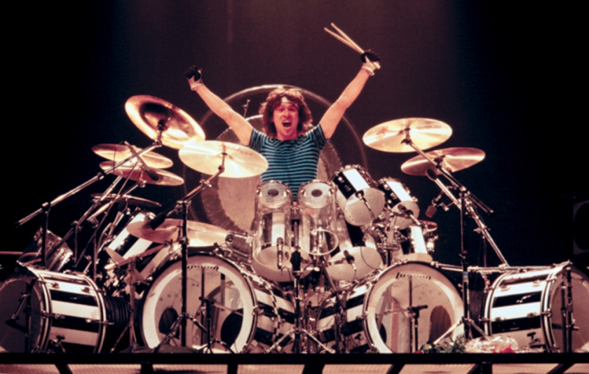 I am Seth. I’m a 9th Grade Freshman, from Indiana. Some of my interests include music, video games, and drums. I joined this art class in order to have a class that essentially would mentally kill me.
Questions for the end of the year:
Did you manage to get over everything you hate about this school?
Did you improve your grades and work discipline?
Were the teachers OK?
What did you think of the overall school?
Papertoy Self-Portrait
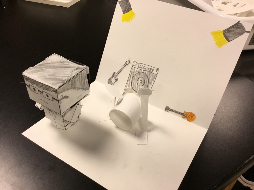 In this assignment, we were told to make a papertoy resembling ourselves, and put it in an environment fitting for the character. For my papertoy, I decided to make a simple figure of myself with a Van Halen shirt. For my environment, I drew a stage, with a guitar, bass, and a 3D drum set.
Light Capturing Designs
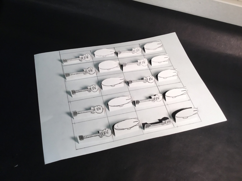
 In this assignment, we had two tasks. Our first was to make a compilation of geometric and organic shapes. After this, we chose two of these shapes to make 10 of each. I chose the Gibson Les Paul and the Zeppelin. I made a 4×5 grid, and then laid out the shapes on each square.
Paper Forms
We learned about making different shapes with paper. Specifically, we first learned about making boxes. I used this knowledge for my assignment. In the assignment, we were told to create a depiction of a natural or a man-made disaster. For this, I used cylinders and cones to make a scene of the Hindenburg Disaster in 1937.
